Sep 212011
 

{click image to view large}

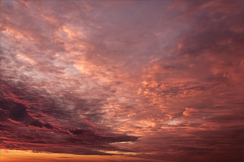
This was a challenging image to process, with respect to color. When I tried to eliminate color casts—using every trick I know—it looked, somehow…wrong. Too, nature doesn’t always conform to our rules of color harmony.  🙂

Now I’ve reset my camera to shoot RAW+JPEG, so I’ll have a color reference. The JPEG preview on my camera display looked accurate in the field but, working solely with the RAW file next day, it was hard to recall from memory.

●●●

Nikon D300; f8 @ 1/180 sec, ISO 720 (handheld);
18.0-200.0 mm f/3.5-5.6 @ 22mm (33mm EFL)
Nov 292009
 

Color swatch light violet Color swatch medium violet Color swatch red [¹]

{click image to view large}

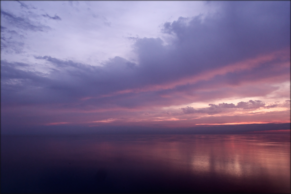
Finally, something different! Clouds but no wind made for a beautiful morning on the lakefront, even though temperature was in the 30’s (F).

Today’s image is a composite of two frames: one to freeze motion in the clouds, and another of 3 seconds on the water to capture its calm and bring out the reflections.

Lesson of the day: Add a Brightness/Contrast adjustment layer and lighten to do a final check for spots — which I just found on my brighter laptop monitor. 😛

—

¹Colors of the day:

  • Light violet R:170 G:169 B:209
  • Medium violet R: 105 G:99 B:148
  • Red R:153 G:110 B:138